AiDA answered user questions inside Ansarada’s platform, and nobody could say whether those answers were any good. There was no feedback loop, no signal, only guesswork. This project introduced a deliberately tiny piece of design: a single-question survey that appears right after each AiDA response, with an optional comment. Small on screen, but it changed the team’s entire relationship with the product, replacing assumptions with evidence, surfacing exactly where AiDA fell short, and establishing a repeatable pattern for testing and learning inside the product. Years before every product team was wrestling with how to evaluate AI output, this was that problem in miniature: how do you know if an AI’s answer helped?
The problem
We were making decisions based on assumptions. We did not know if AiDA’s responses were accurate, if they were useful in context, or how people felt about the answers they were receiving. For an AI feature, that is a dangerous place to sit: quality issues stay invisible until they become trust issues, and trust issues surface as silent abandonment rather than complaints.
The goal
Introduce a way to measure how well AiDA was performing without disrupting the experience. The mechanism had to be:
- Fast to respond to
- Easy to understand
- Non-intrusive
- Valuable enough that users would actually engage
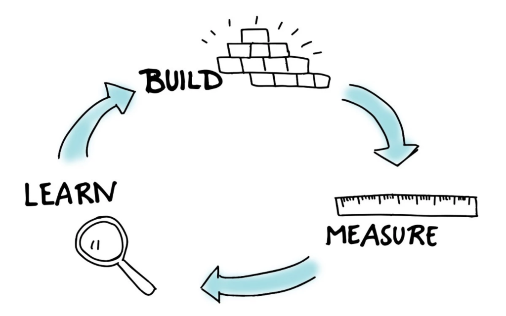
The intention was never to design a perfect measurement system upfront. It was to get something live, learn from it, and evolve. Speed to signal beat completeness of signal.
Approach
This was treated as a small but important product experiment, optimised for speed to validation, simplicity of interaction and clarity of signal.
Start with the moment that matters
Feedback was triggered immediately after AiDA returned a response. Context was still fresh, users did not have to recall their experience later, and responding felt natural rather than forced. Timing did more for response quality than any visual design decision.
Keep the interaction lightweight
One question. One optional comment field. No friction, no cognitive load. Responding had to feel effortless, not like a task the product was assigning the user.
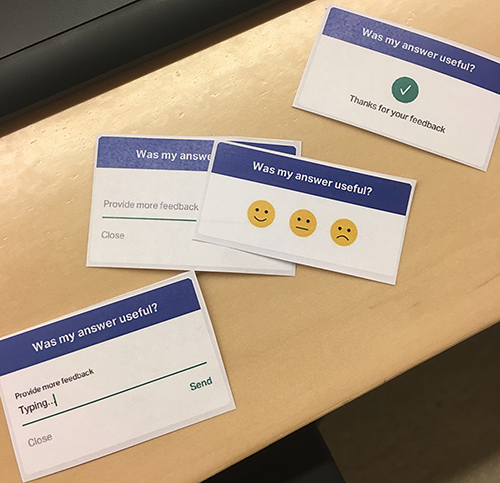
Find the right question
A surprising amount of the work was wording. We tested variations: “How useful was my answer?”, “Was my answer accurate?”, “Did I answer your question correctly?”, “How satisfied are you with my answer?”. Testing showed that simpler phrasing performed better, open-ended framing produced more meaningful feedback, and overly specific wording biased responses. We landed on a question that felt clear, neutral and easy to answer. The lesson generalises: in feedback design, the question is the product.
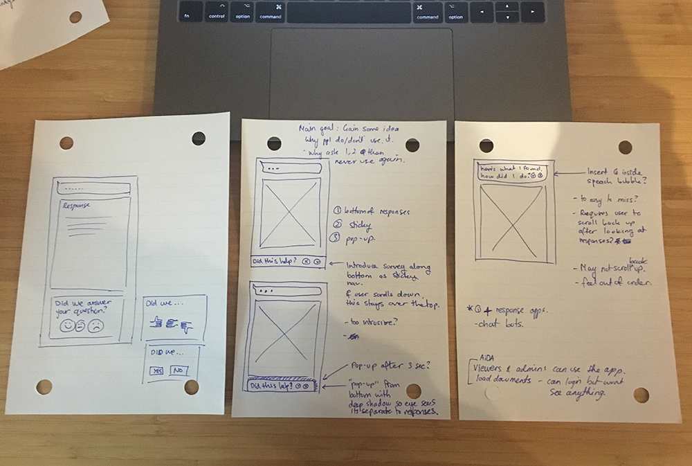
Test early, test physically
We ran hallway tests with paper prototypes. Users interacted with AiDA in a real scenario, responded to the survey immediately after, and talked through their thinking. This told us whether the question made sense, how people interpreted the response options, and where they hesitated or dropped off, all before writing a line of production code.
Iterate the UI to reduce friction
Several concepts explored how visible the survey should be. Should it sit inside the response or apart from it? How much visual weight? Does it compete with the answer itself? The final direction deliberately reduced emphasis: neutral palette, integrated subtly into the response area, clear but never attention-grabbing. The survey’s job was to support the experience, not interrupt it.
Design for what comes next
While the first release was simple, we explored how the pattern would survive AiDA’s evolution, including a concept embedding feedback into a continuous chat experience where each response carries its own feedback affordance. The solution was designed not to become redundant as the product matured, which is exactly the shape AI feedback took industry-wide.
Solution
A lightweight, in-context survey appearing after each AiDA response: one clear question, optional qualitative input, minimal visual disruption, built from existing ACE components for speed and consistency.


How we measured success
This was about signal, not perfection. We tracked response rate, quality of qualitative feedback, and patterns in sentiment. Results were reviewed weekly and synthesised with affinity mapping, 2×2 prioritisation and dot voting with the team, turning raw feedback into recurring issues, prioritised improvements and insights fed straight back into product development.
Outcome
The feedback loop gave us something we did not have before: visibility. We moved from assumptions to evidence, understood where AiDA was falling short, and identified concrete opportunities to improve accuracy and clarity. Just as valuably, it created a repeatable pattern for how the team tests and learns within the product.
What I learned
Not every problem needs a complex solution. Sometimes the most valuable thing you can design is a simple mechanism for learning. This project reinforced the value of shipping early to reduce uncertainty, designing for real behaviour instead of ideal scenarios, and treating design as a tool for insight, not just output.
Related work: more on shaping and measuring AI output in teaching an AI to sound like one person, and the design system behind Ansarada’s product, ACE.
Frequently asked questions
What is AiDA?
AiDA is Ansarada’s AI assistant, built to answer user questions inside the platform. At the time of this project, the team had no way of knowing whether its answers were accurate or useful, which is the gap this feedback loop closed.
Why use a single-question survey instead of a detailed feedback form?
Because response volume beats response depth when you have no signal at all. A one-question survey with an optional comment keeps friction near zero, so enough people answer to reveal real patterns. Longer forms produce richer individual answers from far fewer people, and mostly from people with extreme opinions.
How did you decide what question to ask?
By testing the wording itself. Variations like “Was my answer accurate?” versus “How useful was my answer?” produced measurably different response behaviour. Simple, neutral, open framing won: specific wording biased people, and complex phrasing lowered response rates.
How was the feedback actually used?
Results were reviewed weekly and synthesised using affinity mapping, 2×2 prioritisation and team dot voting. That ritual turned individual responses into recurring themes, which became prioritised improvements to AiDA’s accuracy and clarity.
Why does this project matter for AI products generally?
Every AI product faces the same question this project answered in miniature: how do you know the output is helping? An in-context, low-friction feedback loop attached to each response remains one of the most reliable ways to find out, and this pattern predates the industry’s current standard of thumbs up and down on AI answers.
Leave a Reply