From brand ambiguity to AI-powered growth engine
Drova’s website had a problem. Not a surface-level one, a strategic one. The platform had matured significantly, the product had evolved, and the team had grown. But the website still reflected an earlier, less established version of what Drova was. It lacked mobile responsiveness, couldn’t support personalised experiences, was difficult for the marketing team to update, and failed to communicate the credibility and authority that enterprise customers expect from a governance, risk and compliance platform.
The opportunity was bigger than a visual refresh. It was a chance to rebuild the website as a genuine growth asset, one that could drive inbound leads, support the sales team with tailored journeys, and scale through an AI-powered content and build process.
The problem
The existing site had several compounding limitations. Navigation was difficult, making it hard for visitors to find relevant content. Online sign-up and demo CTAs lacked the context and education needed to convert effectively. The CMS was design-intensive and non-responsive, making it slow and costly to add new pages. And perhaps most critically, the site failed to serve any visitor a truly personalised experience, regardless of their industry, role or objective.
For a platform built on the premise of helping organisations run with confidence and clarity, the website wasn’t doing the same for Drova.
My role and approach
I led the end-to-end creative process, from defining the strategic and emotional direction of the brand through to visual design, template execution, and supporting the marketing team’s implementation.
The project had two distinct phases that required different kinds of design leadership.
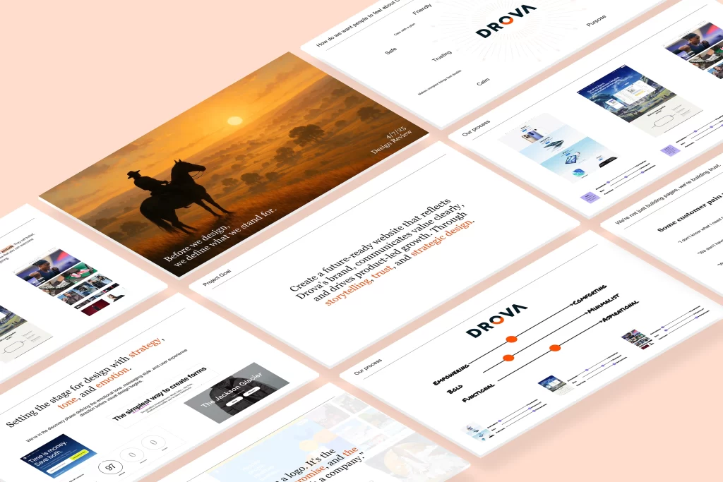
Phase 1: Defining what Drova stands for
Before any design work began, I facilitated a series of workshops with the broader Drova team to answer a more fundamental question: who do we want to be as a brand?
Inspired by the Simon Sinek principle that people don’t buy what you do, they buy why you do it, I structured the workshop process around building a shared emotional foundation before touching any visual decisions.
The first workshop explored what makes a strong brand, looking at companies whose identity extends well beyond their products. Apple, Nike, Intercom, Atlassian. We analysed their emotional hook spectrums across dimensions like empowering vs comforting, bold vs minimalist, and functional vs aspirational. This gave the team a shared visual language for talking about brand positioning.
From this research we mapped Drova on a competitive matrix, “what they sell” vs “how they do it”, and identified a clear opportunity. Drova sat in a space that combined functional value with the potential for a more aspirational emotional register. The goal was to move toward being more empowering and comforting simultaneously, a brand that makes complex things feel doable, that projects confidence without coldness.


We landed on Drova’s emotional value proposition: clarity in complexity. The brand would sell confidence, the feeling that you’re in control, that you understand what you need to do, and that you have a trusted partner helping you get there.
From this alignment we developed Drova’s brand tonality spectrum: conversational but authoritative, positively proactive in attitude, supportive in friendliness. Values surfaced in the session became pillars of the brand narrative: purposeful leadership, progress powered by people, doing things differently, care backed by action.
We then presented these outcomes to the wider company, translating the workshop thinking into a clear, compelling story that brought everyone at Drova on the journey.
Phase 2: Visual design and creative direction
With brand direction locked, we moved into the visual design phase, working through a structured research and exploration process before moving to execution.
Research and moodboarding
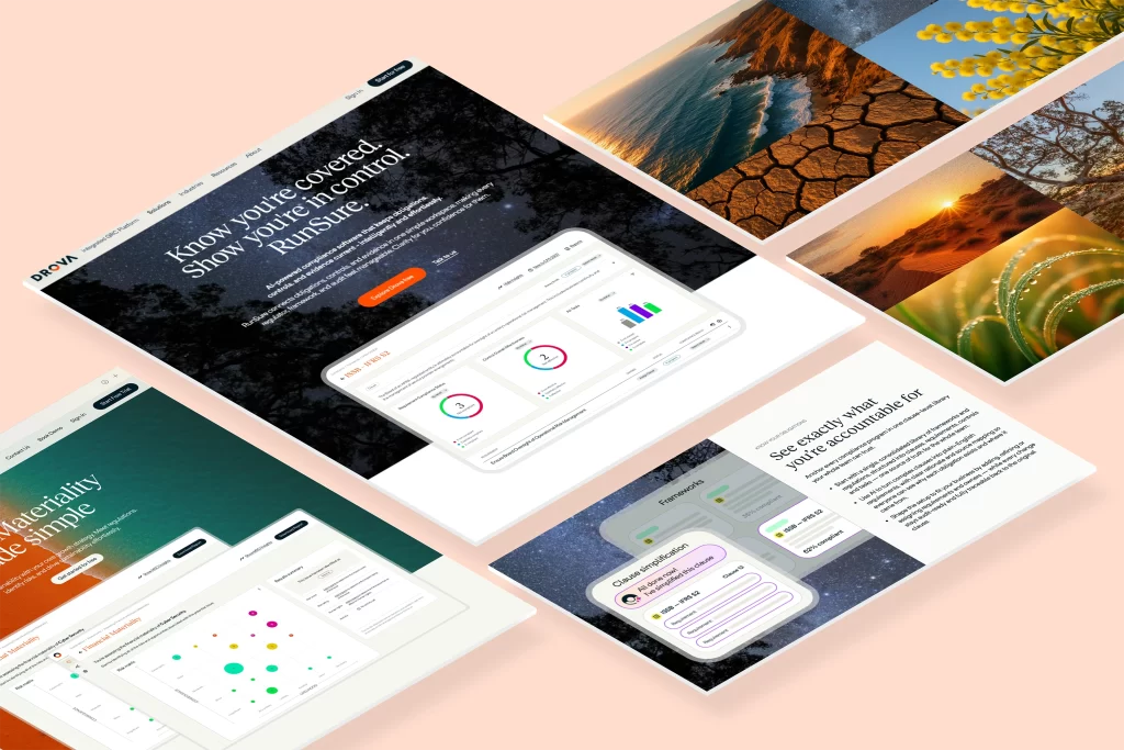
We conducted extensive competitive research across the SaaS landscape, reviewing structural patterns, visual treatments, photography styles, and messaging approaches across reference brands including Intercom, Linear, Ramp, Salesforce and others. This informed clear principles for the new Drova site: the structure of most high-performing SaaS product sites follows a recognisable arc, lofi product shots or interactive demos, feature highlights, social proof, and a clear CTA at the bottom. We identified how Drova could leverage this arc while injecting its distinct brand personality throughout.
Visual language and photography style
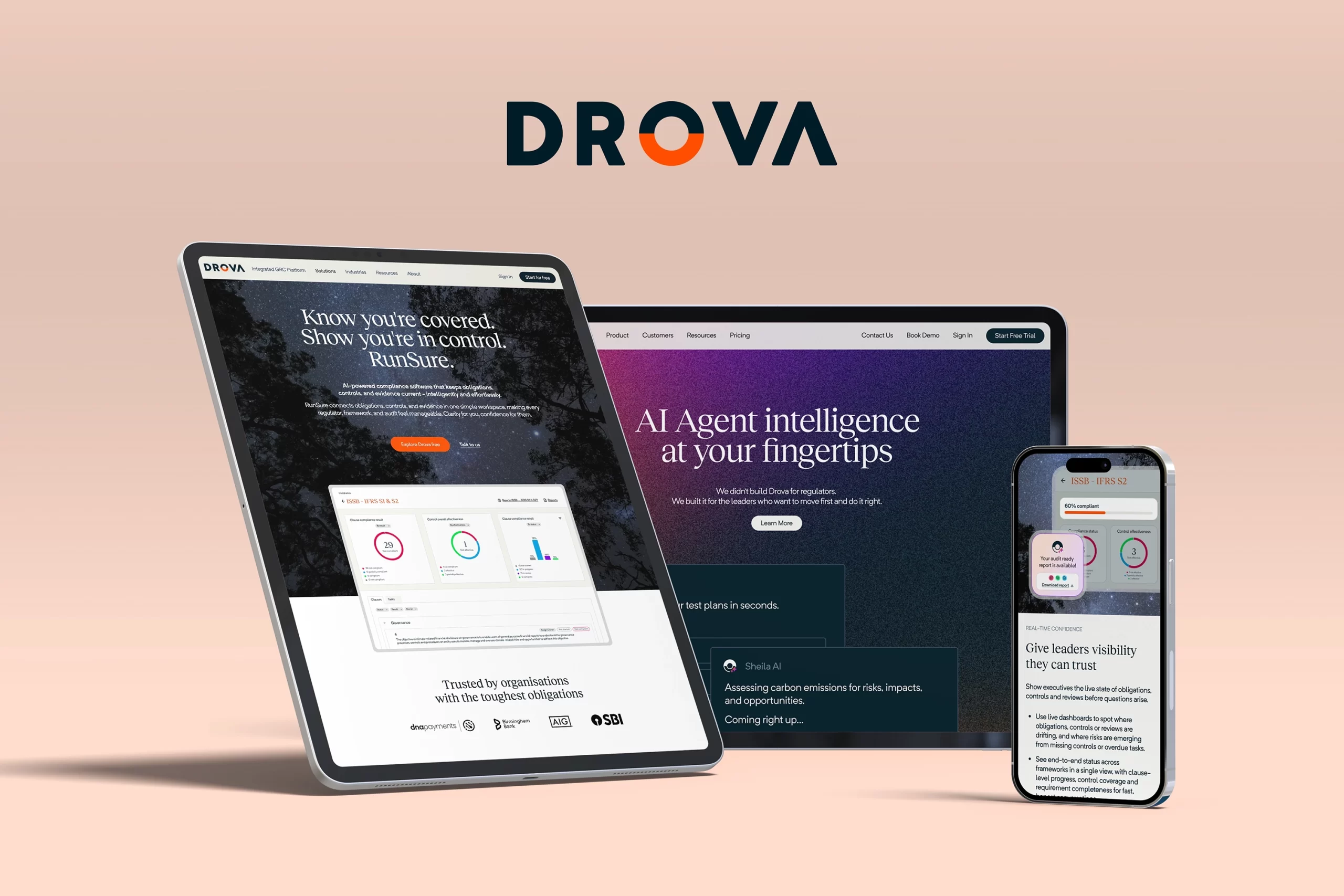
A key design decision was the treatment of hero and feature imagery. After exploring multiple directions, we established a photography approach that overlays stylised product illustrations over photography, giving Drova a distinctive visual language that sits between editorial warmth and product clarity. This was documented as clear design guidelines covering when and how to use hero photography, product shots, stylised mockups, and product overlays.
We also developed the visual identity for Sheila AI’s presence within the site, establishing a dark, illustrative aesthetic for AI-specific templates that differentiated the intelligence layer of the platform from the product pages, while remaining coherent within the broader brand.
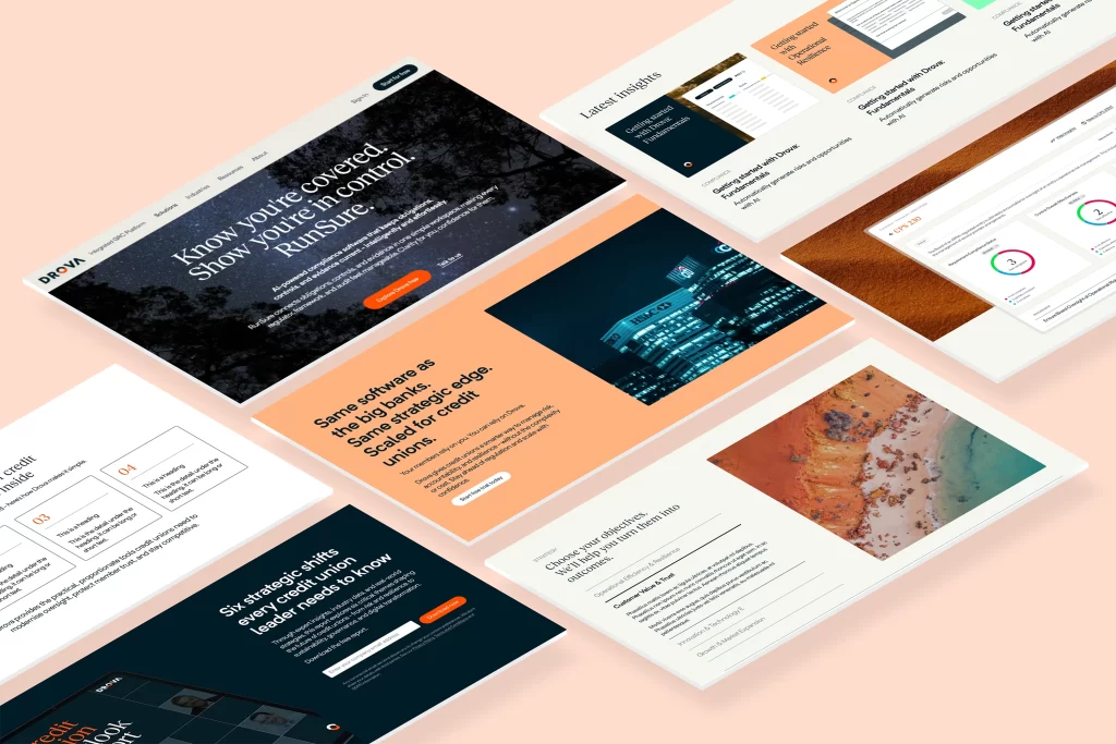
Page templates and design system
The scale of the new site required a systematic approach. I designed and documented a complete set of page templates, including product pages, industry pages, SEO and LLM pages, blog pages, conversion pages, and Sheila AI-specific templates, along with a comprehensive library of reusable content blocks and components.
Every template was designed with flexibility and consistency in mind. Colour palette usage, typography hierarchy, component states, and layout rules were defined and documented to support both the design system and the AI workforce that would later use these templates to generate pages at scale.
The Figma file became the single source of truth, housing component variants, colour options, template structures, and annotation notes that communicated design intent to developers and content teams.
Supporting the AI-powered build
The marketing team led the content strategy and AI agent build process, developing an agentic workforce using Claude and other LLMs to generate, review, and publish pages at scale. My role in this phase shifted to creative oversight and implementation support, ensuring that the pages being built through the AI process adhered to the visual direction, brand guidelines, and design system established in Phases 1 and 2.
This meant reviewing outputs, providing guidance on edge cases the templates hadn’t anticipated, and working closely with the marketing team to resolve design-implementation gaps as they emerged.
The outcome
The results came quickly. Within months of launch, the site was performing measurably differently, not just aesthetically, but commercially.
Year-on-year for February, engagement rate climbed to 42.17% (up 19.58 percentage points), bounce rate dropped by the same margin, and key events grew by 58.9%. Leads increased 62.6% YoY, with MQLs up 84.5% and the MQL rate rising to 66.5%, meaning more traffic was arriving with genuine intent, and more of it was converting into qualified pipeline.
The free-trial page moved from outside the top 10 to the number two page site-wide in a single month, up 212% month on month, with 12 free trial sign-ups in February alone, representing roughly 21% of all-time sign-ups concentrated in one month. Post-decision pages showed engagement rates between 75% and 99%, consistent with evaluation behaviour rather than passive browsing.
ASRS-related content emerged as the primary conversion engine, with the CFO Disclosure Checklist driving 32 form submissions, the highest of any asset on the site. The content was clearly reaching people at the right moment in their decision-making.
Perhaps most tellingly, ChatGPT began sending referral traffic across 15 tracked URL entries spanning 12 unique pages, reaching not just blog content but regulatory solutions, trust and legal pages, and the demo page. The site had become findable and credible not just to search engines, but to AI systems surfacing it during active buyer research.
The new Drova website launched as a fundamentally different kind of asset from its predecessor: modular, scalable, personalised, and AI-powered, capable of growing continuously without proportional design effort.
What I learned
This project reinforced something I’ve believed for a long time: the most important design decisions aren’t visual ones. The work that had the greatest impact on the final site happened in workshops, in conversations about brand values, in competitive matrices on a Miro board. Visual design executes strategy, but if the strategy isn’t defined clearly first, even beautiful design misses the mark.
It also showed me what’s possible when design systems are built not just for consistency, but for delegation. By designing templates and components with enough specificity that an AI workforce could apply them reliably, the design work scaled far beyond what any individual designer could execute manually. That’s not design becoming less important. That’s design becoming more strategic.
This site was built on the AI design system infrastructure I created for Drova, with Sheila’s voice woven through it.
Frequently asked questions
Why did Drova need a website redesign?
The platform and team had matured but the site still reflected an earlier version of the company. It was not mobile responsive, could not support personalised experiences, was slow and costly for marketing to update, and failed to project the credibility enterprise GRC buyers expect. The redesign rebuilt it as a growth asset rather than a brochure.
What was the brand work behind the redesign?
Before any visual design, I facilitated workshops to define who Drova wants to be as a brand. We mapped emotional hook spectrums against companies like Apple, Nike and Atlassian, positioned Drova on a competitive matrix, and landed on the emotional value proposition of clarity in complexity: a brand that sells confidence and makes complex things feel doable.
How was AI used in building the site?
The marketing team built an agentic workforce using Claude and other LLMs to generate, review and publish pages at scale. My templates, components and documented design rules were built specifically so that AI could apply them reliably, with my role shifting to creative oversight and resolving edge cases the templates had not anticipated.
What results did the new website deliver?
Year on year for February: engagement rate up 19.58 percentage points to 42.17 percent, key events up 58.9 percent, leads up 62.6 percent, MQLs up 84.5 percent. The free trial page jumped to the number two page site wide in a single month, and ChatGPT began sending referral traffic across 12 unique pages, showing the site had become credible to AI systems as well as search engines.
What is a template system and why did it matter here?
A documented set of reusable page layouts and content blocks covering product, industry, SEO, blog, conversion and AI specific pages. It mattered because it let the site scale through AI powered production without proportional design effort, while keeping every new page consistent with the brand.
Leave a Reply