- Role: Head of Design
- Initiative: Drova’s FY26 company-wide annual theme
- My contribution: Strategic compression, concept development across four directions, visual identity, launch film direction, AI-orchestrated production, organisational embedding
In early 2025, Drova had just split from its parent company into a standalone startup with roughly two years of runway to find product market fit. Leadership walked into the year with a list that read more like a backlog than a strategy: a new platform, an online channel, MVP “skateboard” modules, AI embedded into everything we build, a narrower ICP, better retention, a scalable acquisition motion. Nine workstreams, all genuinely important, none of them telling anyone which mattered most on a given Tuesday.
Most of the leadership team, myself included, had come from the mature company we’d just split from. We knew how to run a mature org. Nobody on the team had run a startup with a two year clock before. So what actually happened on the ground was teams pulling in different directions, each optimising for their own slice of the list, because there was no shared read on what the year was asking of us. That’s not a clarity problem. Everyone could recite the list. It’s a translation problem: nobody had converted the list into something a person could feel, and carry into a Monday stand up, without running it through their own function first.
The annual theme initiative started, as these things usually do, as a leadership team brainstorm. We sat in a room and threw around ideas. Some were good. None of them were developed past the sentence they were pitched in.
The problem
I want to be specific about what “fragmented” actually looked like, because it wasn’t chaos. It was something quieter and harder to fix. Teams that had spent years inside a mature, well resourced parent company were now expected to move with startup urgency: faster decisions, less certainty, tighter feedback loops. That’s a mindset shift, not a process one, and mindset shifts don’t respond to a new OKR template.
The nine priorities I mentioned (new platform, online channel, skateboards, AI everywhere, ICP discovery, PMF, CAC, scalability, retention and expansion) were all correct. That was actually part of the problem. A laundry list of correct priorities gives everyone permission to pick the one closest to their own role and call it the priority. Product picked the platform. Growth picked CAC. Nobody picked the thing that made all of them move together, because that thing didn’t have a name yet.
Not a surface level problem. A strategic one. Drova didn’t need another slogan for the all hands deck. It needed a rallying cry: something that could hold nine different priorities inside one idea, and make an engineer and an account manager feel like they were running the same race.
My approach
Traditionally, an initiative like this sits with the CEO. They set the theme, and design gets briefed to build the creative around it. Nobody handed me that brief. What I saw instead was a room full of good instincts and no one taking a half formed idea and developing it into something concrete enough to argue about. So I did that, uninvited, because it looked like the kind of gap a design leader is actually positioned to close. I sit close enough to strategy to understand what the business needs, and close enough to craft to know how to make an abstract idea legible to two hundred people at once.
The first move wasn’t creative. It was compression. I took the nine item list and reduced it to three words: the WHO, the NEW, and the AI. Not because the nuance didn’t matter, but because nuance is what gets lost when a message has to survive being repeated fifth hand in a team stand up. Once I had that compression, I used it as a filter. Every theme concept I developed had to visibly serve all three, or it wasn’t worth pitching.
The work
Building four worlds, not one
I could have brought one polished direction to leadership and asked for a yes. I didn’t, because a single option invites a vote on taste, not a conversation about what the year actually requires. I developed four, each with a full concept: a core idea, a metaphor, a strategic mapping back to the WHO, the NEW, and the AI, a visual world, and a set of taglines and activation ideas for how it could actually show up in the business across the year. That last part mattered to me. A metaphor that only works on a poster isn’t a strategy, it’s decoration.
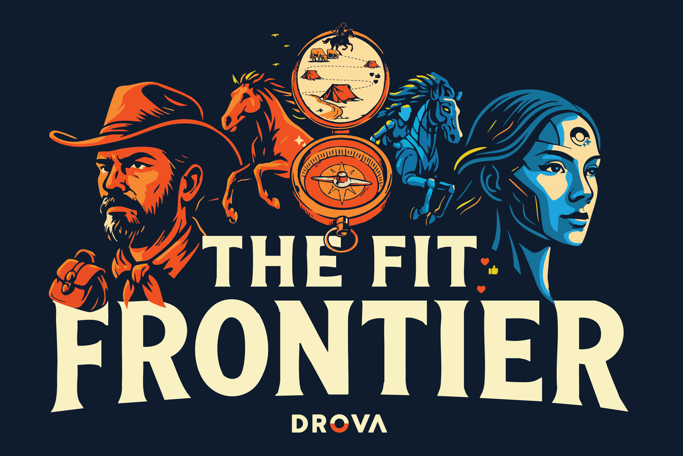
Ready Player One put the customer at the centre of the year rather than the team. The pitch: the business is a game engine, the product is the immersive world, the customer is the protagonist, and we build to equip, guide, and empower them. Sheila, our AI, became “the friendly voice in the ear,” and the team split into designers of the quest, engineers of the unlockables, and ops as level builders. It was a genuinely strong customer-first narrative. But a theme’s first job that year was to point the team at itself, at how we worked together, before it could credibly speak in the customer’s voice. This one pointed outward too early.
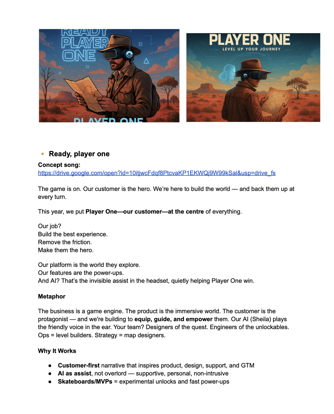
Fit to Drive (later folded into “Driver Assist Activated”) cast AI as a co-pilot embedded in how we worked, not a feature category bolted onto the roadmap. Lane Keep Assist became staying aligned to mission. Blind Spot Detection became catching the customer insight the rest of us would miss. Adaptive Cruise Control became matching our pace to the market instead of our own comfort. Tagline: “Smarter systems, sharper signals.” It was the sharpest AI integration of the four concepts, and it still fell short, because it described a system, not a person. Nobody rallies around a dashboard.
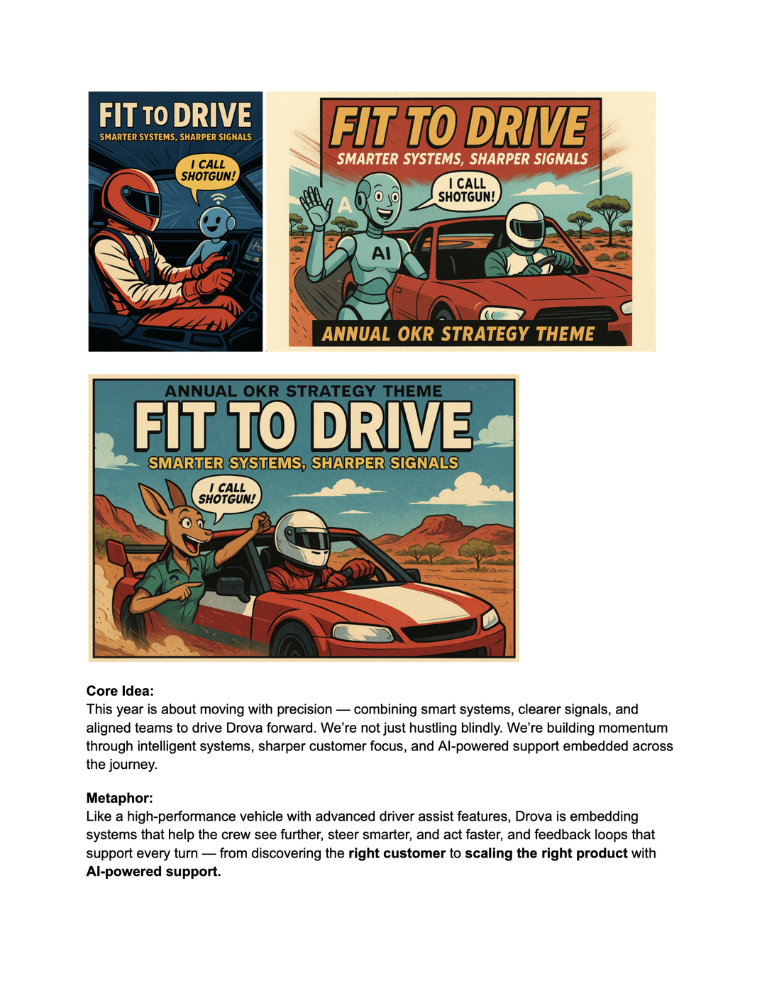
Ride the Reveal framed the year around uncovering things we hadn’t seen yet: the real customer, the real product fit, the signal inside the noise. PMF discovery became “revealing the true path.” AI became “seeing what humans miss.” Tagline: “See it clearly. Ride it fast.” It mapped cleanly, but when I sat with it, the feeling was passive. Revealing something is a thing that happens to you. I wanted a metaphor with a verb in it.
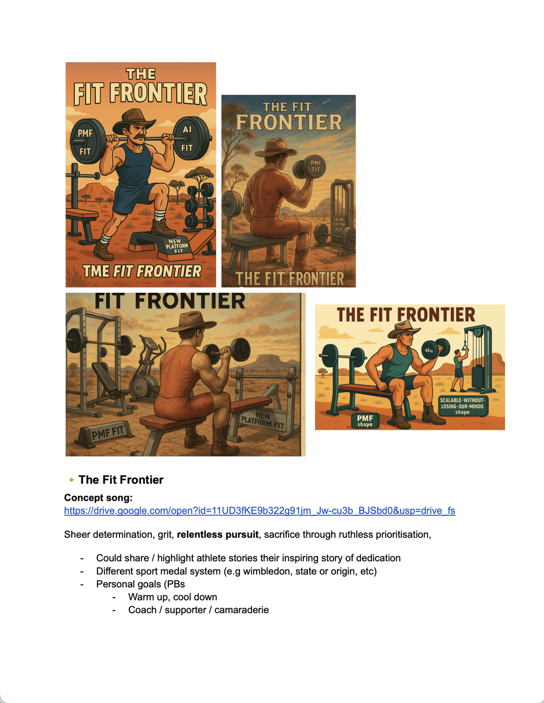
The Fit Frontier started as the least serious of the four, which is exactly why it nearly didn’t survive. The original version was gym culture parody: getting Drova “PMF fit,” “AI fit,” “scalable without losing our minds” fit. I had taglines like “no more dad bod MVPs” and “shredded CAC, bulked up retention,” activation ideas built around personal bests and warm up rituals, and imagery of a drover doing dumbbell curls in the outback. It mapped well enough (PMF became getting fit, AI became a trainer, MVPs became training drills) but it was a joke wearing a strategy’s clothes, and I knew it wouldn’t survive first contact with a board deck.
The turning point
Somewhere in the second or third pass at the concept, I realised what I’d actually gotten wrong. I’d built a metaphor about individual fitness for a problem that was never about individuals. Drova’s people weren’t underperforming on their own. The company was failing to move as one body. The challenge in front of us wasn’t personal productivity, it was coordinated execution: could nine workstreams and a dozen teams move like they were running the same play.
That’s when I stopped looking at gym culture and started looking at elite team sport. I’d been watching Welcome to Wrexham around that time, and what struck me wasn’t the football, it was how a struggling club rebuilds belief: through shared standards, visible resilience after setbacks, and a culture where everyone, from the owners to the groundskeeper, is oriented toward the same win. That was the organisational problem I was actually trying to solve, just dressed in football instead of GRC software.
So I rebuilt the mapping around a team, not a gym.
| Elite sport | Drova |
|---|---|
| Game plans | Strategic alignment |
| Tracking stats | Customer and PMF data |
| Training | Iteration and experimentation |
| Team chemistry | Cross-functional collaboration |
| Setbacks | Failed experiments |
| Comebacks | Organisational resilience |
That single shift, from individual to team, from gym to game, is what turned The Fit Frontier from a decent internal joke into the thing that ended up carrying the whole year. It stopped being about looking good and started being about winning together, which is a much easier thing for two hundred people to actually organise around.
Building the world
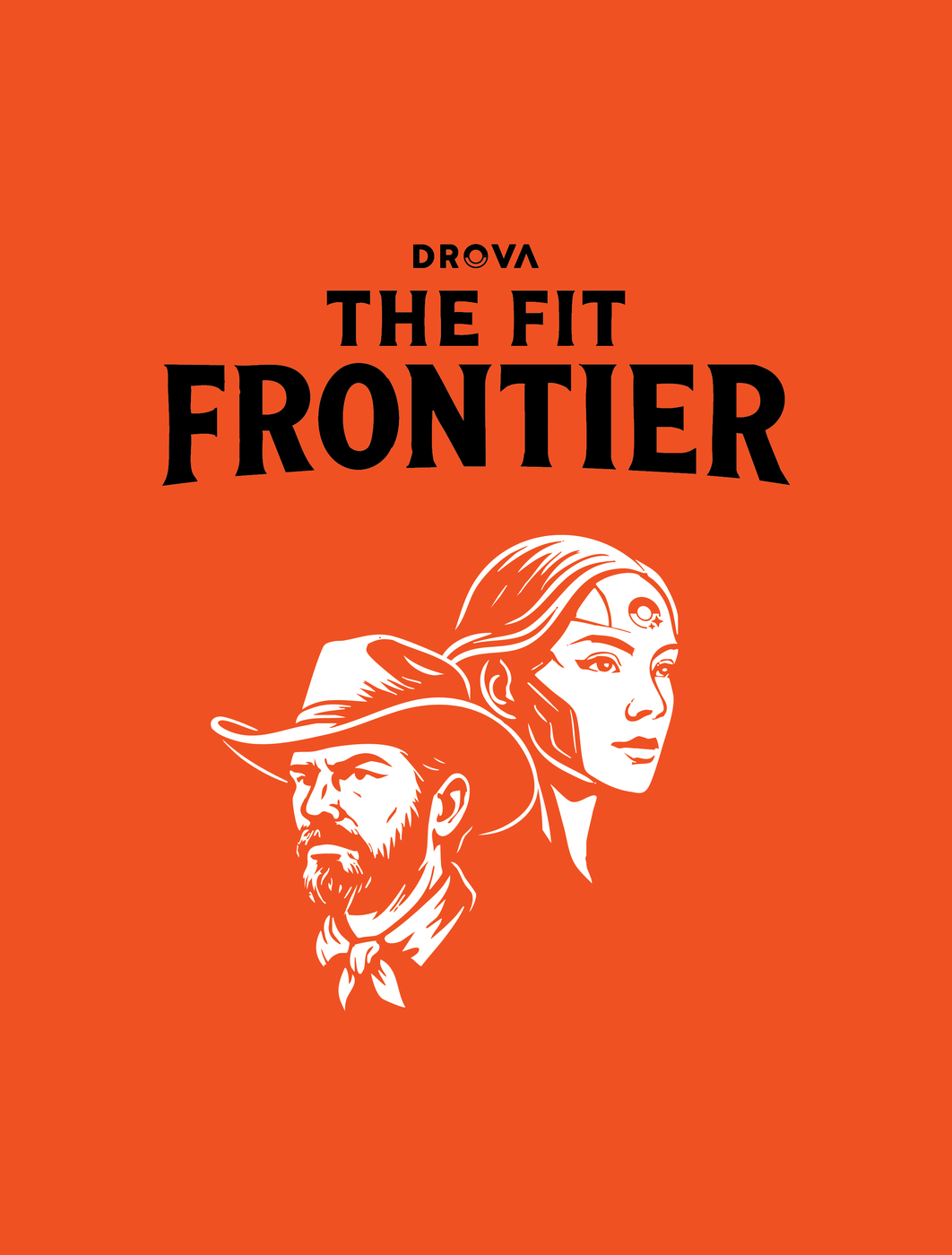
I didn’t want this to read as a startup mascot exercise, so I anchored the visual language in something that was already true about the company. Drova is named after the Australian drover: someone who moves livestock across difficult terrain toward higher ground. That’s already the company’s core metaphor for what it does for customers, guiding them through GRC complexity toward clarity. So the final poster didn’t invent a new world, it extended the one we already had. The drover carried the grit. Sheila carried the guidance. Horses carried momentum. A compass carried direction. And climbing camp markers tied the whole thing back to the previous year’s theme, Ascend, so the story read as a continuation, not a reset. That poster is what opens this case study.
Using AI as a thinking partner, not a production line
I want to be precise about how AI showed up here, because “AI assisted” undersells what actually happened. I used it to pressure test ideas at a speed that let me develop four full concepts instead of one half considered one: prototyping visual worlds, drafting metaphor systems, storyboarding the launch film, and writing exploratory lyrics for each direction before I’d committed to any of them.
The lyrics, embedded above alongside each concept, were the strangest and most useful part of the process. For each direction, I wrote a short, deliberately silly concept song so leadership could feel the vibe of an idea before we’d spent a cent on production. They weren’t meant to be good. They were meant to make an abstract strategic direction laughable or exciting within thirty seconds, because that reaction told me more than a slide ever could about whether a metaphor would survive contact with the whole company. In the end, we didn’t use any of those concept songs in the final film; we went with a more cinematic track built around a low, guttural hum, closer to the sound a crowd makes before kickoff than anything melodic. The songs did their job earlier, in the room, and then got retired.
The launch film
I didn’t want a hype reel. I wanted people to feel the mindset before they heard a single message, the way you feel the atmosphere in a stadium before a whistle blows. The soundtrack was chosen for that low, pre-competition energy, and the film was structured into chapters lifted straight from sport: Game Plan, Team Work, Wins, Tracking, Setbacks, Comebacks, Repeat. Each chapter mapped to a behaviour I actually wanted reinforced (alignment, resilience, customer obsession, iteration) so the film worked less like an announcement and more like a rehearsal of how we wanted the year to feel.
The outcome
I’ll be honest about what this did and didn’t do, because the honest version is more useful than the flattering one. Fit Frontier never turned into a viral internal meme. People didn’t spontaneously drop it into meetings, and Slack didn’t light up with reactions the day it launched. If I’m grading this against “did it become organic company slang,” it didn’t.
What it did do: leadership carried the theme through weekly discussions of our principles and focuses for the rest of the year, not as a callback but as working language. “PMF fit” became genuine shorthand internally for the kind of disciplined growth we were chasing. Our quarterly recognition posts were explicitly tied to people demonstrating the Fit Frontier mindset. And the theme shaped our company book club selection, Legacy by James Kerr, whose themes of humility, discipline, and collective standards were close enough to what we needed that the two reinforced each other for the rest of the year.
The visual system extended into a full rollout: a keynote deck used for leadership comms all year, and a company t-shirt our CEO wore on launch day.
The assets outlasted the launch moment too: the poster, the film, the storyboards, the OKR mapping, and the internal keynote deck, all still in active use as reference material for how we talk about the year. That persistence is the actual measure I care about. A theme that only lives in the town hall it launched in was never a strategy. This one kept showing up, uninvited, in ordinary weeks, which is the only test that matters.
What I learned
Organisations don’t align around strategy documents. I’d have told you that before this project and believed it in the abstract. What I understand now, having built the thing, is how much of that alignment work is actually design work, not communications work: choosing which metaphor a company thinks in, deciding what gets to stand for “winning,” building the symbol before you build the slide. Nobody assigned me that job. I don’t think anyone else in the room saw it as a job that existed to be picked up.
The other thing I took from this: the parts of the process that felt least serious, the joke taglines, the terrible concept songs, the gym parody first draft that never should have seen daylight, weren’t wasted effort. They were how I found the real idea. If I’d tried to go straight to “elite team sport” without first writing “no more dad bod MVPs” and hating it, I’m not sure I’d have understood why the individual framing was wrong. Play isn’t the opposite of rigour in this kind of work. It’s usually how rigour gets there.
Leave a Reply