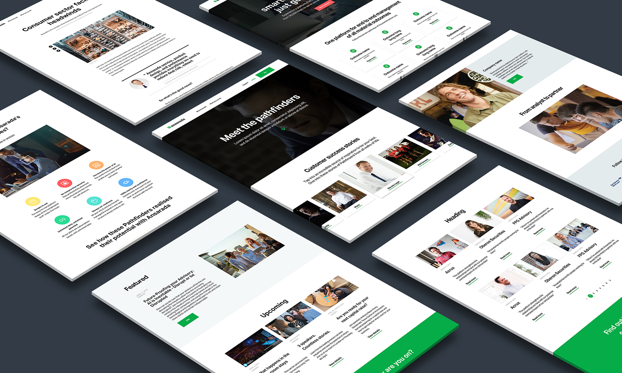
Ansarada had a website that worked but did not guide. Every visitor saw the same content, no matter who they were or why they had arrived. I led a redesign that turned a static, one size fits all site into an intent driven experience that adapts to each visitor’s role, industry and goal. The result behaves less like a brochure and more like a product, guiding people from first click to clear next step.
The problem
The experience felt generic. Whether you were an advisor, a buyer or part of a deal team, you landed on the same page, the same language and the same story. That created a few real problems:
- The value of the platform was hard to understand.
- The positioning felt blurred.
- Content did not reflect real user intent.
- The visual design lacked impact.
The performance metrics reflected all of this. Bounce was high, engagement was low, and there was no clear path through the site. Visitors were given information, but never direction.
The shift in thinking
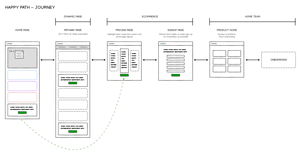
Instead of designing pages, I focused on designing pathways.
The core idea was simple. People do not come to a SaaS website to browse. They come with intent, a job to be done. So the experience needed to respond to that, not by asking users to work it out for themselves, but by guiding them into a journey that felt relevant from the very first moment.
Approach
Introduce intent driven entry points
At the top of the experience I introduced a dynamic, mad lib style interaction. In a single sentence, visitors could define:
- What they wanted to do
- Their industry
- Their role
From there, the site adapted. Content, structure and messaging all shifted to reflect that context. It turned a static experience into something responsive, without ever feeling complex. A first time visitor and a returning advisor could land on the same URL and be met with two genuinely different, relevant journeys.
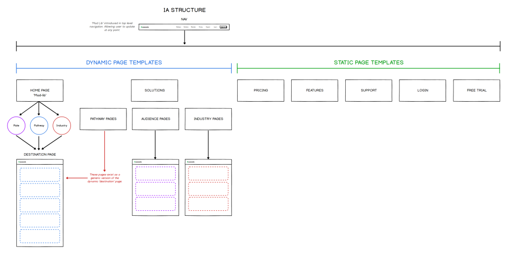
Rebuild the information architecture
I restructured the site into two clear systems:
- Dynamic pages driven by user input
- Static pages for broader exploration
This kept navigation stable and predictable while the content beneath it became far more intentional. Visitors always knew where they were, even as the messaging tailored itself to them.
Design a content model that guides, not just informs
Across every page I introduced a simple but powerful structure: Why, How, What.
Content started by connecting emotionally and contextually, then moved toward functional detail. This gave people a sense of direction. It helped them understand not just what the product does, but why it mattered to their specific situation.
Create a modular system for scale
To support all of this, I designed a flexible set of components and templates that could be reused across both static and dynamic pages. That made it far easier to:
- Maintain visual and structural consistency
- Scale content quickly
- Support different user journeys without redesigning from scratch
It also laid the foundation for a broader design system that the team could keep building on.


Designing for a real user
To ground the work, I mapped a core journey around a representative user.

Jeff is an advisor at an investment bank. He lands on the site while researching tools for an upcoming M&A deal. Instead of navigating a generic homepage, he is guided into a pathway that reflects his role and intent. Within minutes he understands what the platform does, how it applies to his situation, and what to do next.
The goal was not just usability. It was clarity and momentum, moving someone from curiosity to a confident next step without friction.
Outcome
The redesign created a more directed and meaningful experience. Key improvements included:
- Higher visitor to MQL conversion
- Reduced bounce rate
- Longer session duration
- More engagement across key pages
More importantly, the site started to behave like a product rather than a marketing layer. It actively guided people forward instead of leaving them to find their own way.
What I learned
This project changed how I think about design. It reinforced that good design is not about arranging content, it is about shaping understanding. When you align structure, content and intent, the experience starts to do the heavy lifting. That is where design moves beyond execution and starts to influence outcomes.
Related work: this redesign laid the foundation for a broader design system at Ansarada, explored in the ACE case studies, and I later led a similar end to end website redesign for Drova.
Frequently asked questions
What was the main problem with the original Ansarada website?
It was generic. Every visitor saw the same content regardless of their role, industry or goal, which made the platform’s value hard to understand and led to high bounce and low engagement.
How did the redesign personalise the experience?
A mad lib style interaction near the top of the site let visitors state what they wanted to do, their industry and their role. The site then adapted its content, structure and messaging to match that context.
What is the Why, How, What content model?
It is a page structure that opens with why the product matters to the visitor, explains how it works, then covers what it does. Leading with relevance and meaning gives people direction before detail.
What lasting value did the project create?
Beyond the site itself, the modular component and template system became the foundation for a broader design system, making future content faster to build and easier to keep consistent.
Leave a Reply