After Part 1 fixed how ACE documentation worked, Part 2 fixed what it meant. The system had become critical infrastructure for product development, but it looked and felt like an internal afterthought: dated next to newer product experiences, disconnected from Ansarada’s refreshed brand, and lacking any identity that communicated its purpose. I redesigned ACE’s identity around the metaphor of a tangram, simple geometric pieces that combine into endless purposeful configurations, and modernised the documentation interface to extend Ansarada’s new brand language into internal tooling. The result repositioned ACE from a functional library into a mature system with a clear presence, and adoption benefited from the recognition and trust that identity creates.
The problem
ACE functioned well as a system, but it lacked a clear identity. As Ansarada refreshed its visual direction, the gap became more visible:
- The design system felt separate from the product it supported
- Documentation appeared dated compared to newer product experiences
- ACE lacked a recognisable identity that communicated its purpose
- The system’s value was not immediately clear to new contributors
None of these are cosmetic complaints. As adoption grew, the system’s credibility increasingly depended on it looking like something the organisation invested in and believed in. A source of truth that looks abandoned invites teams to treat it as optional.
Opportunity
Rather than treating ACE as an internal tool, we saw the opportunity to position it as a living system with its own meaning and narrative. The goal was to make ACE feel intentional, recognisable, aligned with the product and brand evolution, and easier to navigate and understand. This was never purely a visual exercise. It was about reinforcing what design systems do: bring complexity together into something coherent.
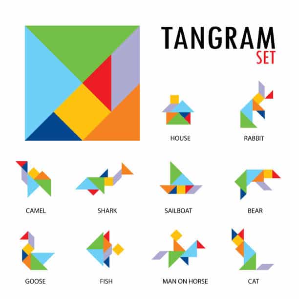
Concept: the Tangram
The new ACE identity was inspired by a tangram. A tangram is formed from simple geometric shapes that combine to create endless configurations; individually simple pieces come together to form something more complex and purposeful.
That is a design system. Components, tokens and patterns are the individual pieces. Assembled thoughtfully, they create robust and flexible user interfaces. The identity communicated what ACE represents, not just what it contains, and gave the system a story people could retell, which is exactly how understanding spreads inside an organisation.
Approach
1. Define the visual language
The ACE logo and identity system were redesigned to reflect modularity and composition. The tangram concept let the identity visually express flexibility, structure, collaboration between parts, and the scalability of interfaces. It needed to feel modern while staying simple enough to sit comfortably within the wider Ansarada ecosystem, an identity for infrastructure, not a brand competing with the product.
2. Align with the evolving Ansarada brand
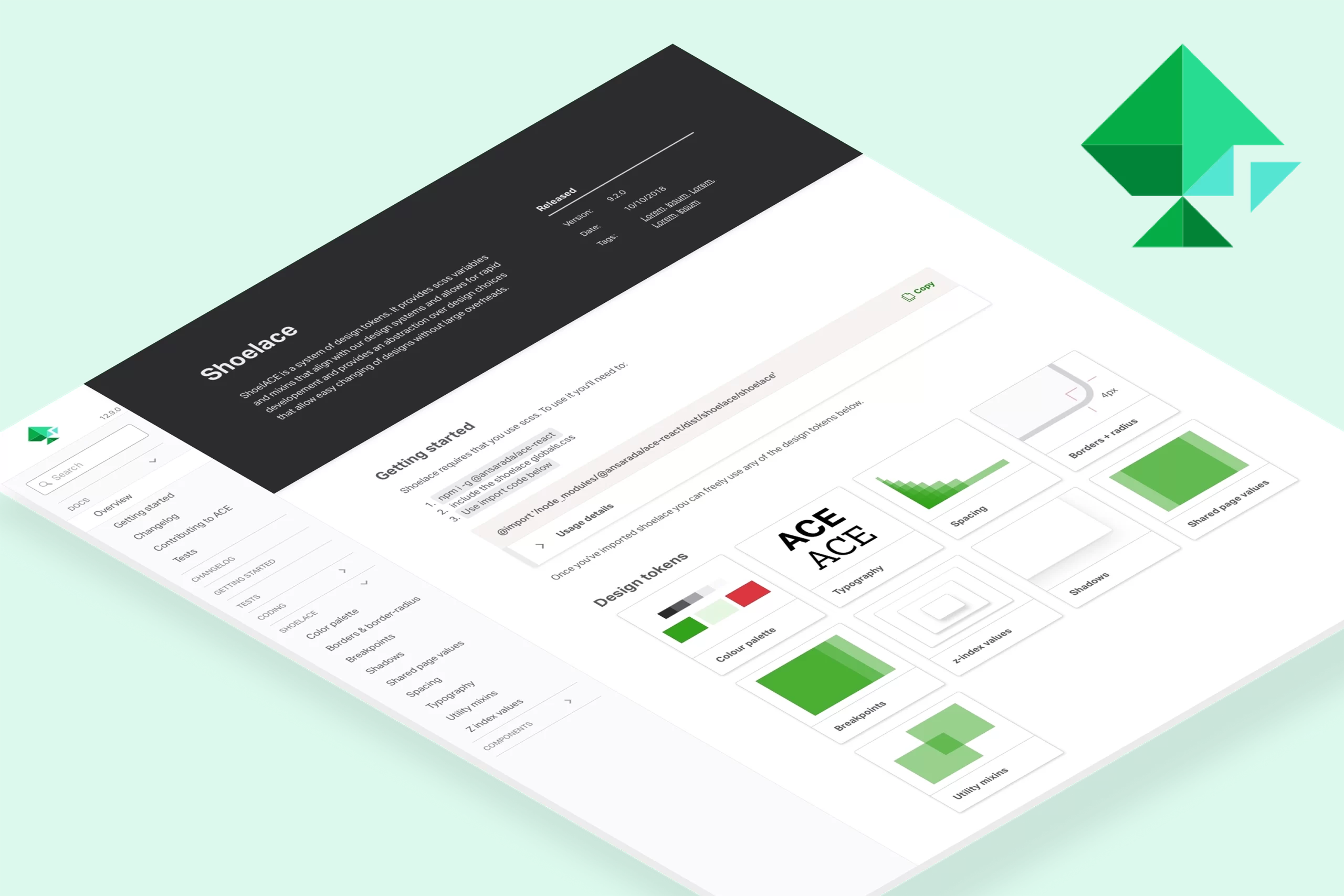
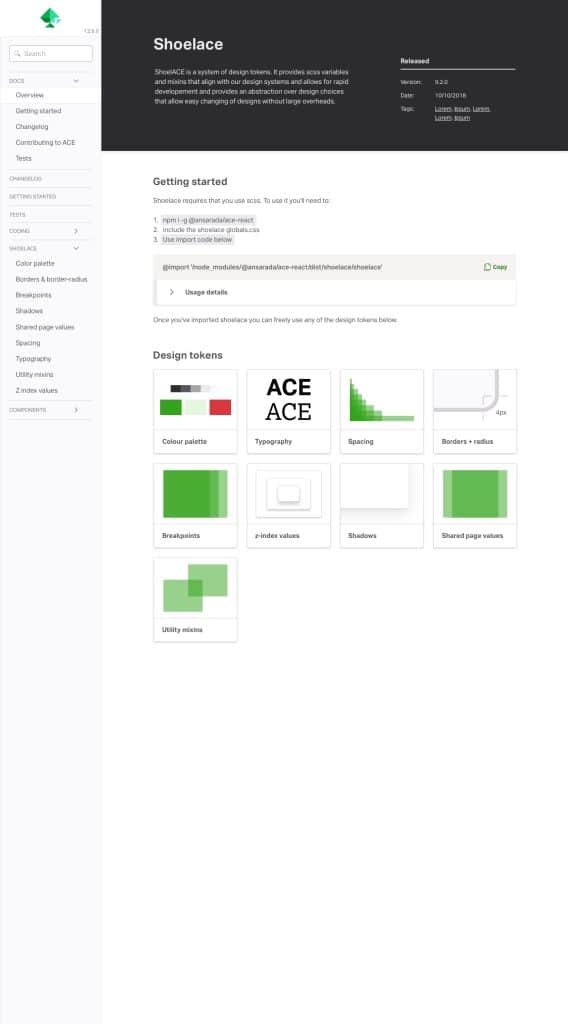
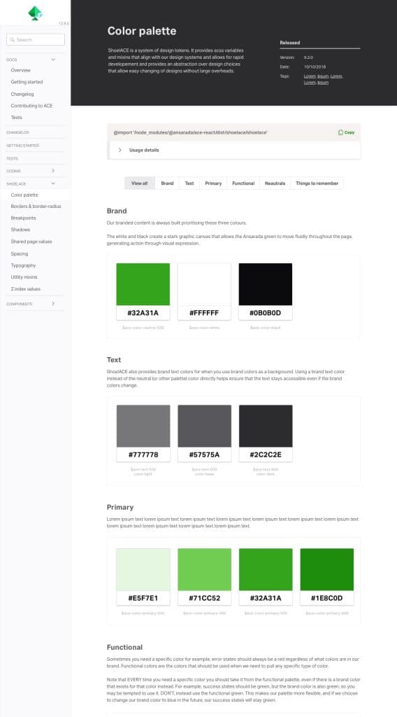
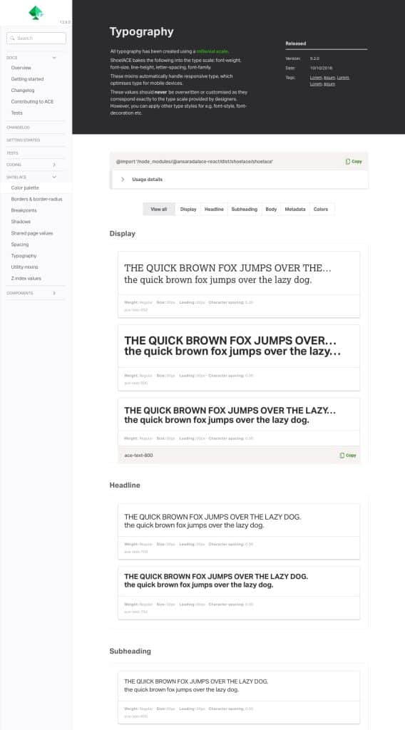
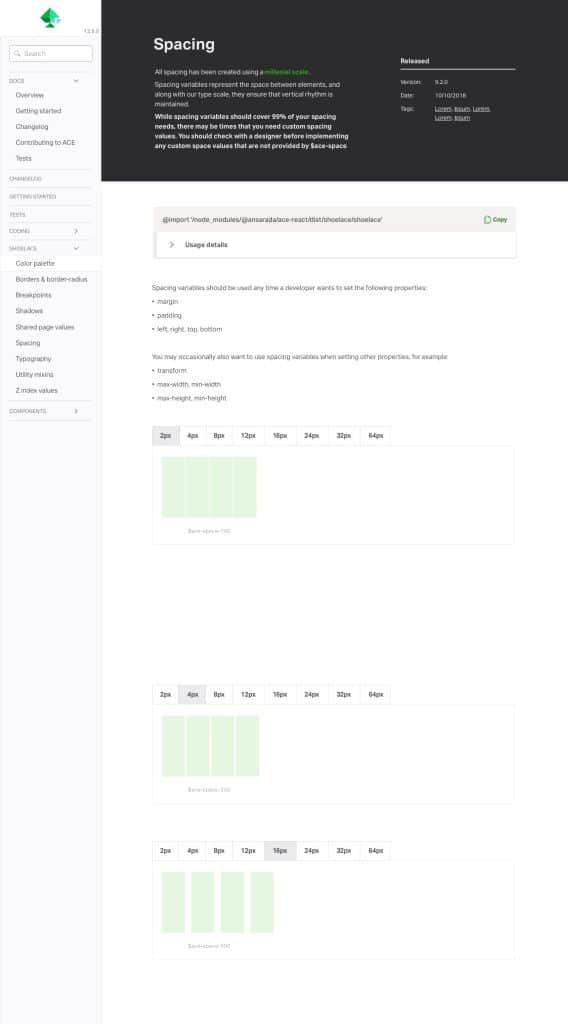
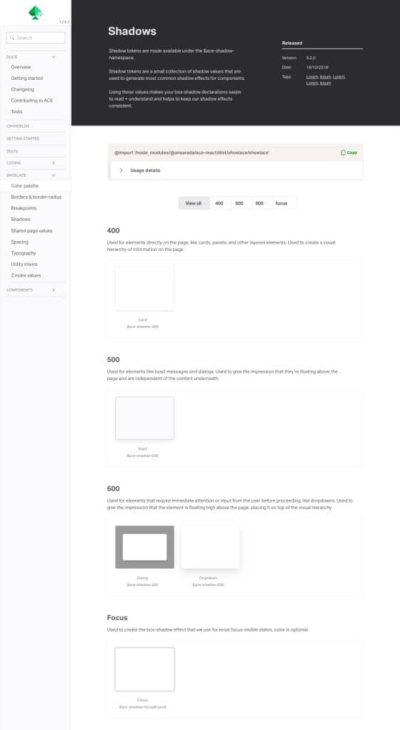
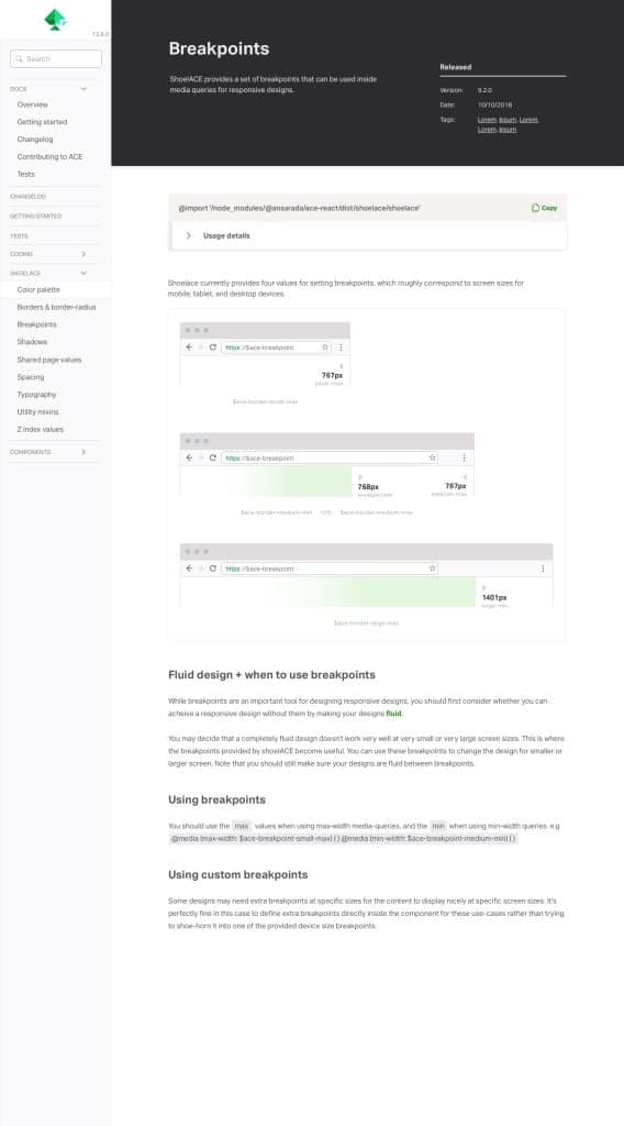
Ansarada was introducing an updated brand language at the time, first explored through the website redesign project. ACE documentation became the opportunity to extend that new direction into internal tooling. The documentation UI adopted the updated typography and colour usage, improved hierarchy and readability, and created consistency between product, marketing and system documentation. Internal tools rarely get this treatment, and that is precisely why doing it signals that the system matters.
3. Improve usability through visual refinement
Every visual update pulled double duty as a comprehension update:
- Clearer information hierarchy
- Improved scanning behaviour for developers and designers
- Better separation between guidance, examples and technical details
- Reduced visual noise
The aim was to make information easier to consume during real working moments, mid-task, mid-build, when nobody has patience for decoration that does not help them find the answer.
Solution
A refreshed ACE identity paired with a modernised documentation interface aligned to the new Ansarada brand:
- A recognisable visual identity grounded in system thinking
- Documentation that felt current and cohesive
- Improved usability through clearer structure and hierarchy
- A stronger connection between the design system and the product experience
Outcome
ACE transitioned from a functional internal library into a mature design system with a clear presence and purpose. The redesign helped reinforce adoption through familiarity and clarity, align internal tools with the external brand evolution, strengthen trust in ACE as a long-term foundation, and communicate the value of systems thinking across teams. It also demonstrated how brand and design systems can work together to support organisational alignment, two disciplines usually kept in separate rooms.
What I learned
Design systems are as much about meaning as they are about components. When people understand the story behind a system, adoption becomes easier. Identity creates recognition, and recognition builds trust. Coherence across brand, product and systems creates stronger experiences for teams and users alike.
Frequently asked questions
Why does a design system need its own identity?
Because adoption runs on trust, and trust responds to signals of investment. A system that looks dated or anonymous reads as optional; a system with a clear, intentional identity reads as infrastructure the organisation stands behind. Identity also gives people a story to retell, which is how shared understanding spreads.
What is the meaning behind the ACE Tangram identity?
A tangram is a set of simple geometric shapes that combine into endless purposeful configurations, which is exactly how a design system works: components, tokens and patterns are simple pieces that assemble into robust, flexible interfaces. The identity communicates what ACE represents rather than just what it contains.
How did Part 2 differ from Part 1 of the ACE documentation work?
Part 1 fixed function: navigation, discoverability, usage guidance and the Orbit engine that auto-generates docs from code. Part 2 fixed meaning: the system’s identity, its alignment with Ansarada’s refreshed brand, and the visual hierarchy of the documentation experience.
Did the rebrand actually improve usability or just the look?
Both, deliberately. The visual refinement carried usability improvements: clearer information hierarchy, better scanning for developers and designers, cleaner separation between guidance, examples and technical detail, and less visual noise during real working moments.
Leave a Reply