ACE had a strong component library and almost nobody enjoying it. Designers and developers found the documentation hard to navigate, unclear to interpret and painful to contribute to, so engagement dropped and teams started working around the system. This project rebuilt the documentation experience from the user’s side: researched where adoption actually broke down, benchmarked best-in-class design systems, tested prototypes with real tasks, and shipped Orbit, a documentation engine that generates component docs directly from code so the documentation can never drift from the implementation again. The design system stopped being a static reference and became an actively maintained product.
The problem
Feedback from designers and engineers showed a consistent pattern: ACE existed, but it was hard to use. Teams struggled with:
- Finding the right components quickly
- Understanding when and how components should be used
- Contributing updates without significant manual effort
- Trusting documentation as a reliable source of truth
That last point compounds all the others. The moment documentation drifts from implementation, every visit to the docs carries doubt, and doubt sends people back to copying whatever the last project did. Engagement dropped, teams worked around the system, and inconsistency crept across the product.
Vision and goals
We wanted ACE to feel effortless: implement design decisions confidently, contribute improvements easily, understand the design language without friction. Beyond the internal impact, we saw an opportunity to eventually share ACE publicly as part of Ansarada’s design maturity, helping attract designers and strengthen credibility in the design community.
Concrete goals:
- Increase contributions to ACE by 25 percent
- Address usability issues within documentation
- Improve consistency across the platform
- Reduce friction between design and development workflows
One shaping assumption: most users would access ACE from desktop environments during active design or development work, so navigation, scanning and discoverability were prioritised for that context.
Approach
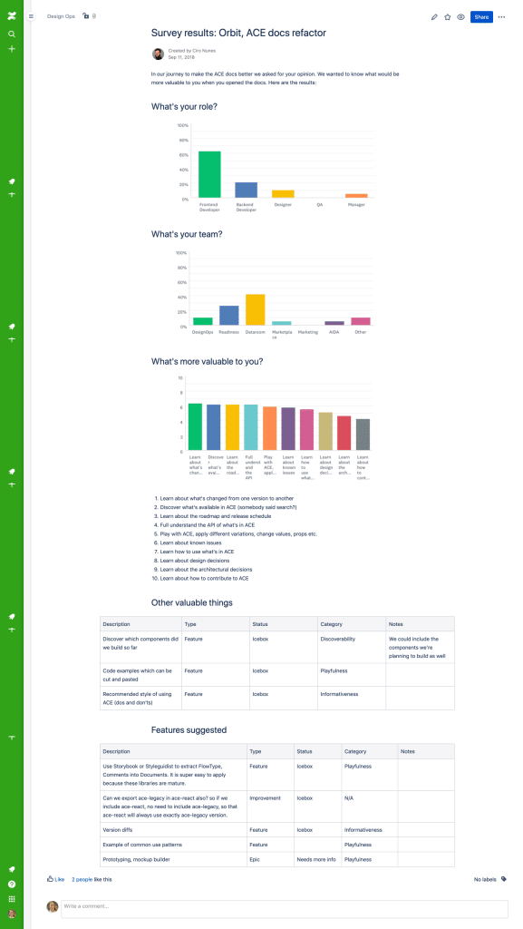
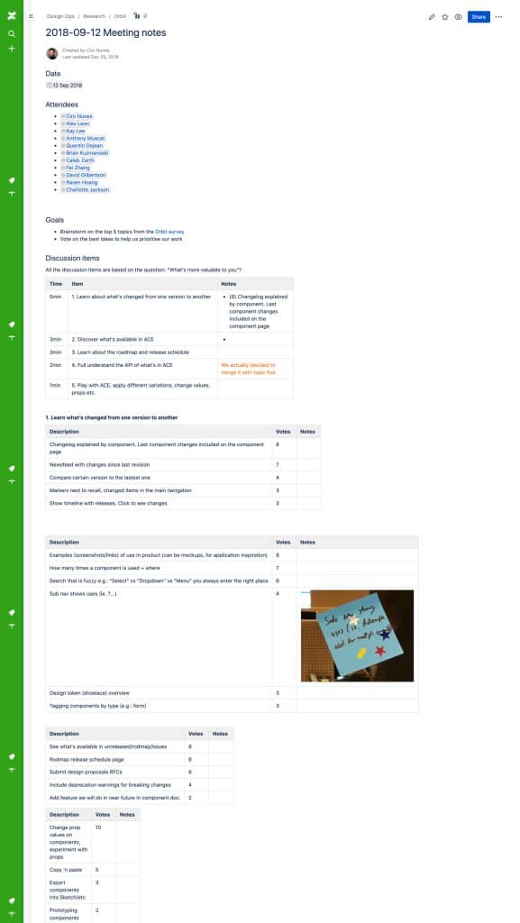
1. Build on existing research, not from scratch
Before I joined, the DesignOps team had already run internal workshops, surveys and ideation sessions on how ACE was being used. Their findings were a strong foundation, and respecting that prior work let us move quickly into problem solving instead of re-diagnosing. Research revealed two major blockers: component documentation was manual, slow and error-prone, and usage guidance was unclear, especially around interaction decisions like when to use similar components in different contexts. The issue was not the components. It was the system supporting them.
2. Learn from best-in-class design systems
We conducted comparative research across leading design systems, evaluating ease of navigation, searchability, component discoverability, and clarity of documentation for both designers and developers. This gave us practical benchmarks instead of designing in isolation, and it clarified which conventions users would arrive already expecting.
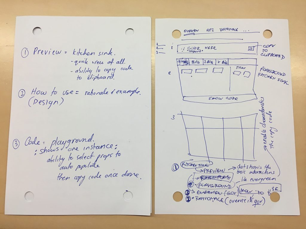
3. Prototype fast, test with real tasks
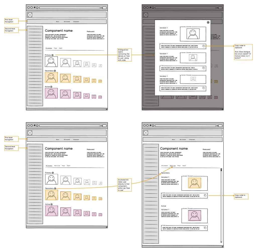
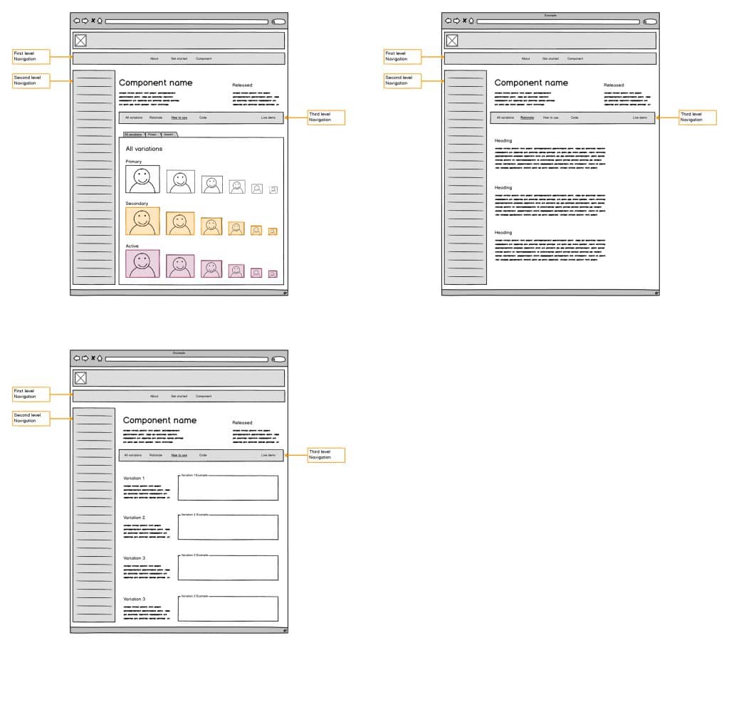
Low-fidelity concepts mapped out navigation structures and interaction ideas quickly. Promising directions became high-fidelity interactive prototypes built on existing ACE documentation. In user testing, participants completed realistic tasks while thinking aloud, which showed us where they hesitated, what information they expected to see, and how easily they could locate components. Insights were documented collaboratively so the whole team owned the iteration, not just the designer running the sessions.
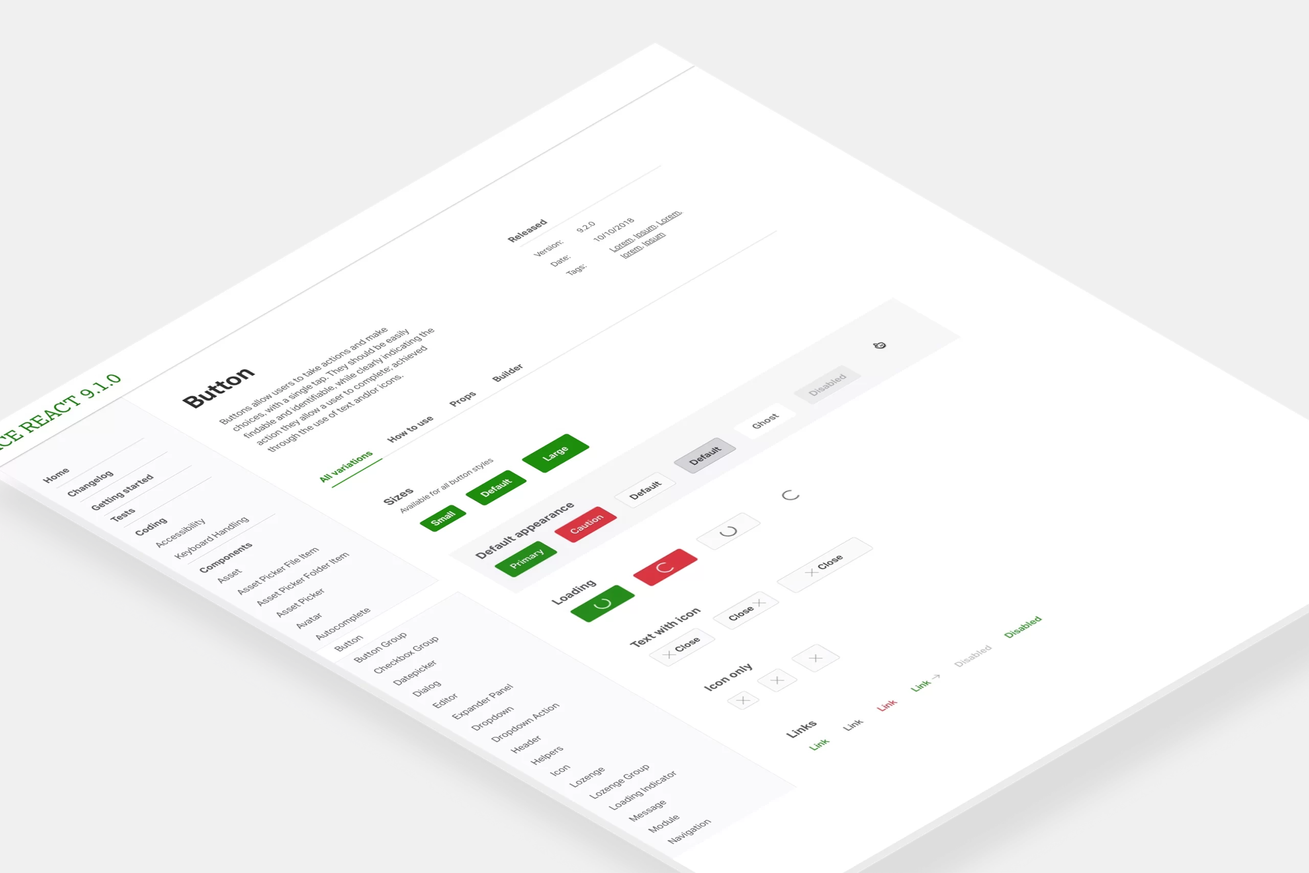
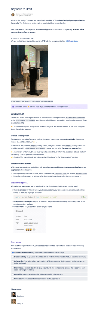
4. Introduce Orbit
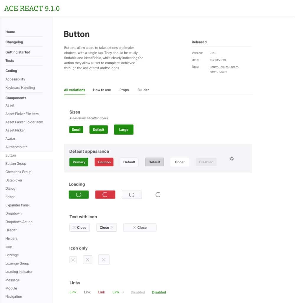
The solution extended beyond a visual redesign. This work led to Orbit, a new documentation engine powering ACE’s React documentation. Orbit automated the generation of component documentation directly from code and development environments, which removed the manual maintenance burden and guaranteed the docs stayed aligned with the implementation. Alongside Orbit, we refined the documentation content itself to better communicate when to use components, where they belong, and how they behave in context, plus a subtle visual refresh for readability.
Solution
A redesigned documentation experience supported by Orbit, enabling:
- Automated component documentation generated from code
- Improved navigation and discoverability
- Clearer usage guidance for designers and developers
- Faster contribution workflows
The shift in kind matters more than any single feature: documentation went from a static artefact someone had to remember to update, to a living output of the codebase itself.
Outcome
Orbit MVP launched internally alongside the updated ACE documentation. The improvements helped reduce friction in adopting the design system, improve confidence in component usage, strengthen alignment between design and engineering, and establish a scalable foundation for future growth. The project also positioned ACE as something worth sharing externally, reinforcing Ansarada’s design capability.
Next steps from here: expand documentation for design tokens and patterns, keep iterating on team feedback, and grow ACE as both an internal tool and an external design asset. Part 2 of this work tackled the system’s identity and brand alignment.
What I learned
Design systems succeed when they support real workflows, not ideal ones. Improving adoption required understanding behaviour, reducing effort, and aligning tooling with how teams actually work. Sometimes the most impactful design work is invisible: it removes friction so teams can focus on solving customer problems instead of navigating process.
Frequently asked questions
Why was engagement with the ACE design system low?
The documentation was hard to navigate, usage guidance was unclear, and contributing updates took significant manual effort. Because docs were maintained by hand, they drifted from the actual code, and teams stopped trusting them as a source of truth.
What is Orbit?
Orbit is the documentation engine created through this project to power ACE’s React documentation. It generates component documentation directly from code and development environments, so the docs stay automatically aligned with what is actually implemented instead of relying on manual updates.
How was the redesigned documentation validated?
Through comparative benchmarking against leading design systems, followed by usability testing of interactive prototypes. Participants completed realistic find-and-use tasks while thinking aloud, revealing where they hesitated and what information they expected, and those insights drove iteration.
Why does automated documentation matter for design system adoption?
Trust. The moment documentation disagrees with the code, every future visit carries doubt and people fall back on copying old work. Generating docs from code removes that drift entirely, which makes the design system safe to rely on and cheap to maintain.
Leave a Reply