Role: Head of Design
Initiative: Stampede 2025, Drova’s inaugural two-week innovation event
My contribution: Event identity design, horse logo mark, medals, People’s Choice lapel pin, champions trophy, launch film
In August 2025, Drova ran its first Stampede: a two-week innovation event where teams pitch new product ideas, get shortlisted against real criteria, then defend them live in front of a panel of leaders and invited customers. The Sydney team flew to Ho Chi Minh City to spend the first week alongside our Vietnam team. I stayed for the full two weeks. It was the first time the company had done anything like it.
The easy version of my job was obvious. Put the Drova logo on a certificate, order some medals off a template, call it done. Nobody would have complained. It was an internal event, not a product launch, and the temptation with internal events is always to treat the design as decoration you apply at the end.
But this was year one of something meant to run every year. That changes what the design actually is. I wasn’t dressing up a single event. I was minting the regalia for an institution that didn’t exist yet: the mark, the medals, and the trophy that a future Drova would recognise as its own, long after anyone remembered who came second in 2025. The brief nobody wrote was to design an event identity for a history that hadn’t happened.
The problem
An internal event has a credibility problem it rarely admits to. You’re asking people to take two weeks out of their actual work, in this case fly to another country, and pour real effort into pitches that get scored and ranked. If the whole thing looks like a lunch-and-learn with a slide-deck header, the effort and the reward stop matching. People can feel when the packaging is lighter than the ask.
So the first job was weight. Stampede needed to feel like a genuine competition, with the ceremony that implies: something you’d actually want to win, objects you’d keep on your desk, a trophy that meant something to lift.
The second job was harder to see. Drova already has a rich brand world, and I didn’t want Stampede to fracture it into a novelty sub-brand that felt bolted on. The company is named after the Australian drover: the stockman who moves livestock across hard country toward better ground, which is already our metaphor for guiding customers through GRC complexity. The drover doesn’t work alone. He has his horse, and he has his hat. That world was sitting right there. The question was never what to invent. It was what to draw out of what we already had.
My approach
I decided to extend the brand rather than escape it, and I let the name carry the idea. A stampede is horses: a lot of them, moving fast, in the same direction. That’s an almost embarrassingly good fit for what an innovation event is supposed to feel like. Energy, power, strength, a kind of freedom. Teams breaking into a run at the same time, which is also a fair description of innovation when it’s working. The horse was already the drover’s companion in the Drova story, so leaning on it wasn’t a stretch, it was a promotion. I took the quiet supporting character in our narrative and gave it the lead role for two weeks.
That single decision, extend rather than invent, is what kept Stampede feeling like Drova having a big year rather than Drova cosplaying as a sports league.
The work
The mark
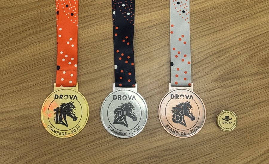
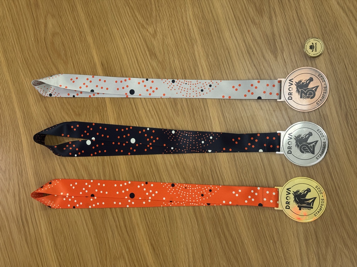
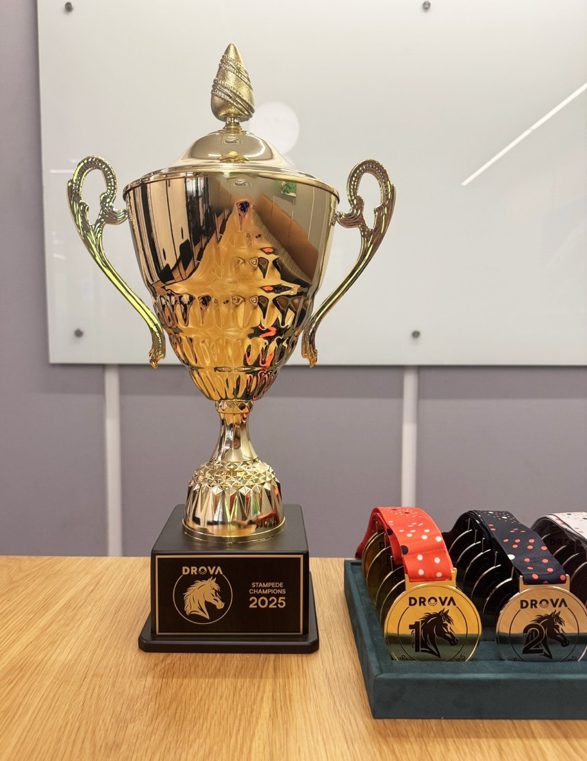
The final mark is a single horse head in profile, drawn as a clean silhouette with just enough line in the mane to give it motion without turning it into an illustration. It sits inside a ring: DROVA across the top, STAMPEDE 2025 around the bottom, so the whole thing reads like a stamp or a seal. It was built to work both ways, reversing cleanly between light and dark depending on where it landed, which mattered once it had to live on a video, a medal, a pin and an engraved plaque.
I wanted it to work instantly at any size, because I already knew where it was going: pressed onto a medal, engraved on a trophy plaque, printed on a lanyard, burning in at the end of a hype film. A silhouette survives all of those. A busy illustration doesn’t. I explored more dynamic directions early, more of the horse, more movement, but they got fussy small and started to feel like a rodeo logo. The still, strong profile held more dignity. It read less like a mascot and more like a crest, which is exactly what I wanted for a competition people were meant to take seriously.
Two honours, two symbols
This is the decision I’m most pleased with, because it came from taking the event’s own rules seriously rather than from a style choice.
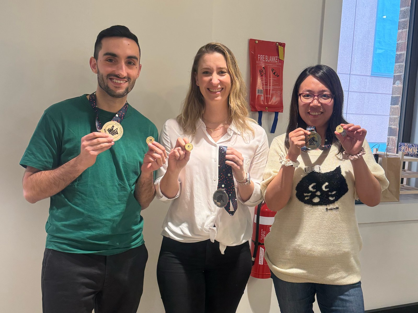
Stampede had two genuinely different kinds of winner. First, second and third place were judged: a panel of Drova leaders and invited customers scored each idea against criteria and ranked them. That’s an expert verdict on a team’s work. Separately, there was a People’s Choice award, voted by everyone who attended the event: a room full of peers pointing at the idea they loved most. Same event, two completely different sources of honour. One is the judges’ call. The other is your colleagues’.
I didn’t want one award system wearing both meanings, so I split the symbols.
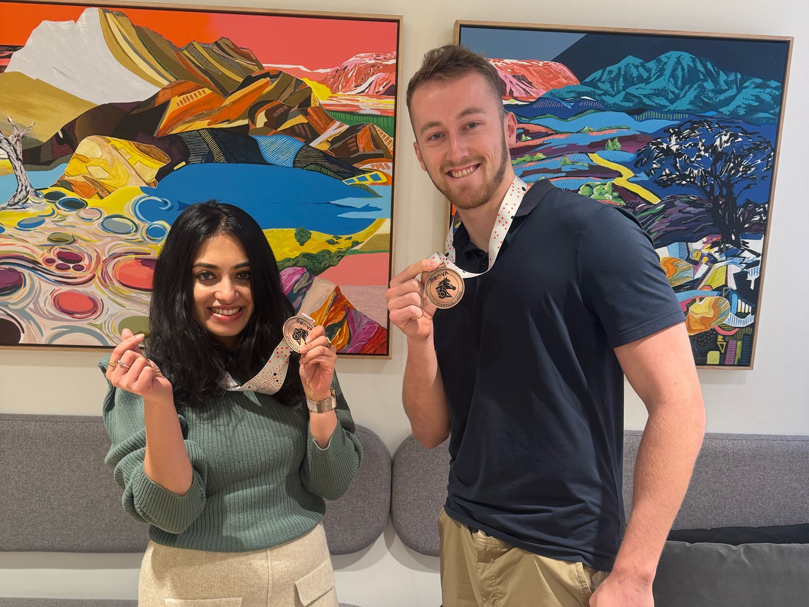
The judged placings got the horse. It’s the event’s mark, it’s about the team and the work, and it belongs on a medal ranked gold, silver and bronze. The medals hang on ribbons colour-coded by placing: orange for first, navy for second, white for third. Those ribbons look like confetti at a glance, but the scattered dots are actually a nod to Drova’s own visual language, the radar-style rings and circular dot motifs the brand already uses across its collateral. So even the ribbon quietly belongs to the parent brand rather than sitting outside it. That was the same instinct running through every piece: borrow from the world we already had rather than invent a parallel one.
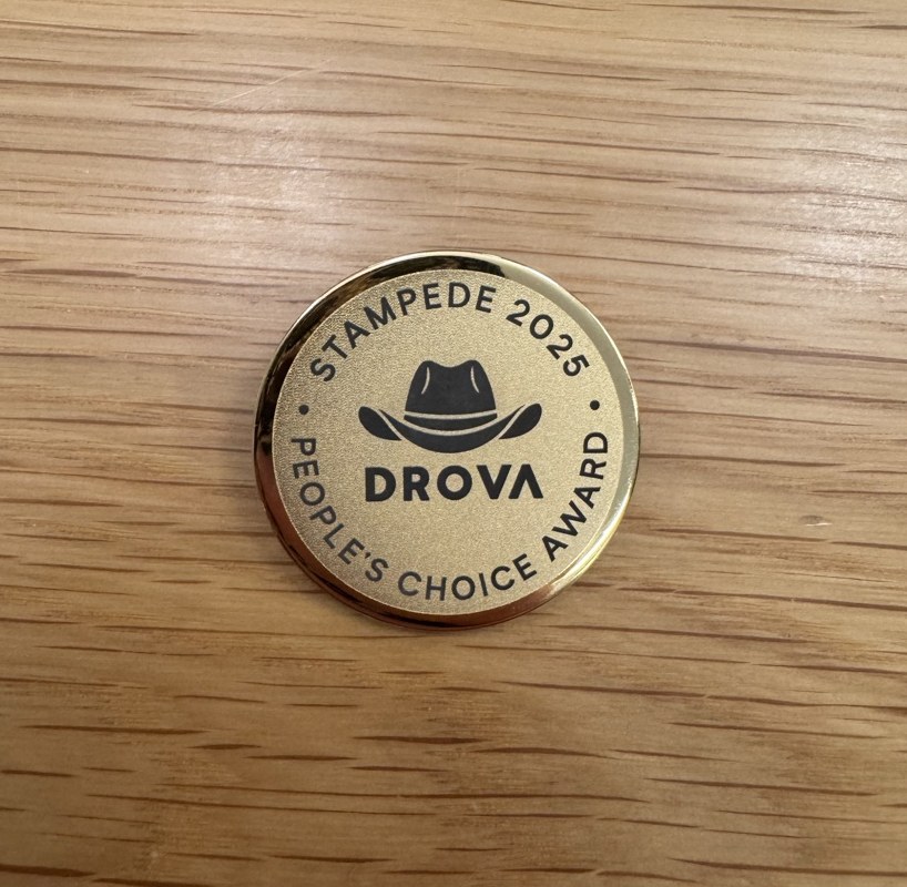
People’s Choice got the hat
The drover’s hat is the most personal object in the entire Drova world. It’s the thing he wears, the iconic piece of him. And there’s an old, loaded gesture in handing someone your hat: it reads as “he chose you”, an honour passed from one person to another rather than a score handed down by a panel. It also let me play on the idea of being “hatted”, of being singled out and celebrated by the room. So the People’s Choice pin isn’t the horse shrunk down onto a badge. It’s a unique drover-hat design, a small gold lapel pin, deliberately different in kind from the medals because the honour behind it is different in kind. A medal is awarded to you. A hat is given to you.
The trophy that fills up over time
The champions trophy is the piece I designed with the least regard for 2025 and the most regard for 2030.
It’s a classic gold cup, unashamedly, on a black plinth carrying the horse mark and “Stampede Champions”. The part that matters is the plaque, because it gets engraved each year with the winning team’s name and the year. In 2025 there’s one line on it. The whole point is the empty space underneath.
A trophy that’s engraved once is a prize. A trophy that’s engraved every year is an institution. I designed it as the object that accrues Drova’s innovation history one line at a time, so that in a few years a new hire can pick it up and read a short, physical record of every team that ever won. That’s a very different brief from “make a nice trophy for the winners”. I was building the container for a history that will mostly be written after this year stops being the current one.
The launch film
The film had one job: set a mindset before the event started. We were about to ask people to be bold, competitive and a little fearless for two weeks, and you can’t instruct that into a room. You have to make them feel it first.
A colleague generated the visuals, the imagery and the video, using AI. I produced the piece. I sourced the backing track against the lyrics, energy and mindset we wanted in the room, then edited the whole thing to build toward the kickoff in Ho Chi Minh City. The edit and the music were doing the real work: turning a set of striking clips into ninety seconds that made people want to get up and run.
The outcome
The first Stampede ran across two weeks and produced real, ranked results:
- First place: Chief Herder, a rule-based workflow automation engine (if this, then that, applied to GRC records).
- Second place: Task Intelligence in the Loop, which also took the People’s Choice award. For full disclosure, this was my team, which means I designed a medal and a pin and then went and competed for both. We came away with the silver and the hat, and no, I did not judge my own category.
- Third place: Drova Atlas.
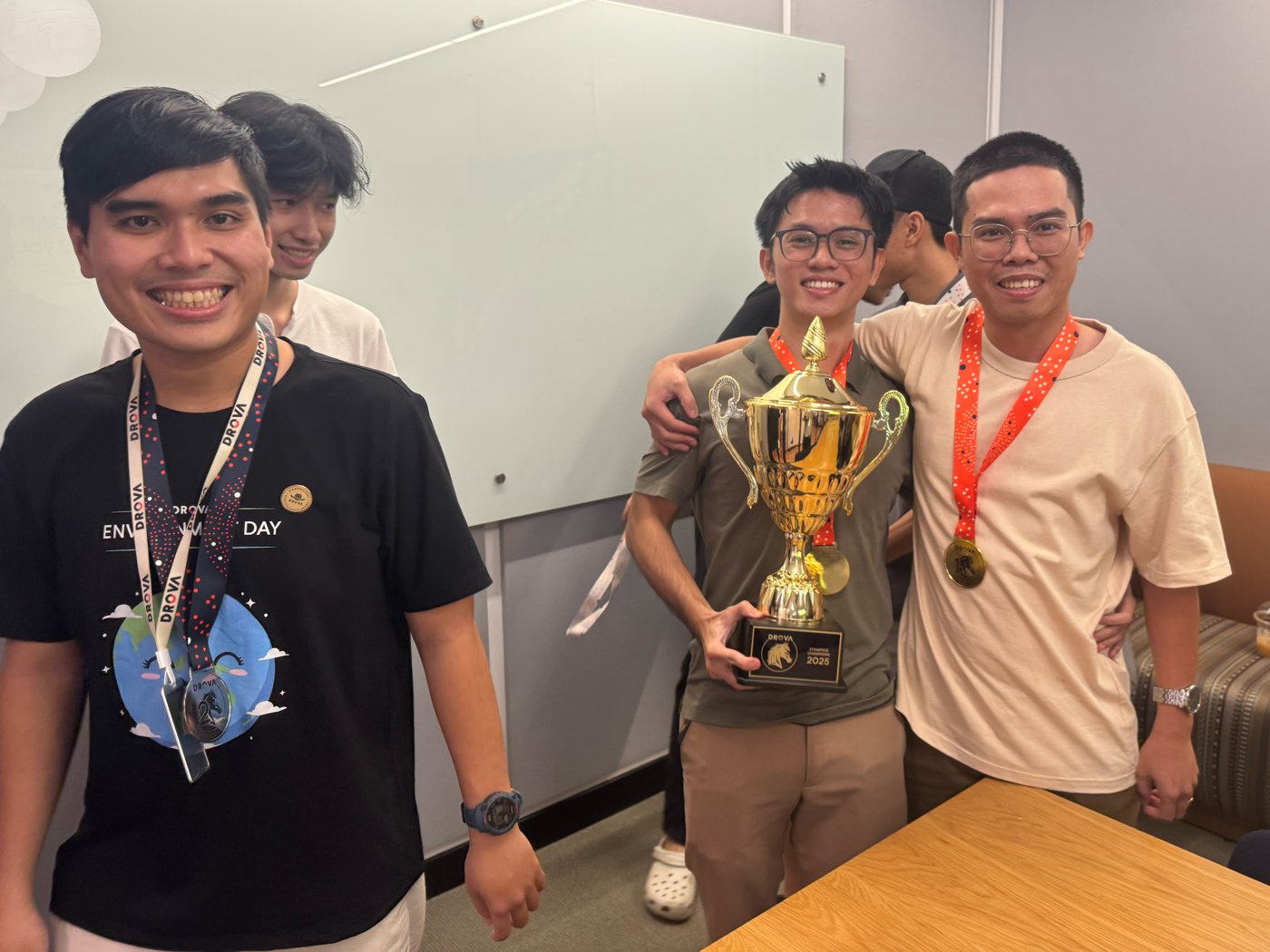
The best evidence that the objects landed came at the awards themselves. When it was time to hand everything out, the energy in the room was extraordinary. Teams crowded around the table and started grabbing at the medals before we’d even called names, and we had to rein them in so we could present them properly. The smiles when people were actually handed their medal, and when the winning team lifted the trophy, were the whole point. You can’t fake that, and you certainly can’t get it from a certificate. That reaction is the entire return on treating ceremony as something worth designing.
Beyond the placings, the thing I care about is that the system was built to outlast its first outing. Stampede is meant to run annually, and everything is now in place for it to: a mark, a medal set, a People’s Choice pin, and a trophy waiting for its second line of engraving. Year one didn’t just crown a winner. It set the template every future Stampede inherits.
I also cut a recap film at the end of the two weeks, a highlights reel of the parts that don’t show up in the scoring: the shared meals, the badminton, the karaoke, the actual texture of a team living and working in the same city for a fortnight. The competition gave the event its stakes. This footage is what people will actually remember.
What I learned
Designing for a first-ever event is quietly different from designing for a one-off, and most of the difference is restraint. The pull is to make year one loud: put “2025” on everything, lean hard on the novelty, treat it as the whole story. But an annual institution needs a design that recedes enough to be reused, and objects built to gather meaning rather than announce it. The trophy taught me that most directly. Its best feature is the blank space, the part that isn’t designed yet, the lines other people will earn and engrave long after this year is a footnote.
The other thing this reinforced: ceremony is a design problem, not a line in a budget. A medal, a pin, a hat, a cup that fills up over time. None of it is decoration. It’s the physical language a company uses to tell its own people that what they just did mattered. Get that language right and people keep the objects on their desks for years, which is close to the only engagement metric that has ever actually meant anything to me.
This case study sits alongside my wider work building Drova’s design foundation, from the AI design system infrastructure to teaching an AI to sound like one person. It covers the Stampede event identity, the horse logo mark, the medal set, the People’s Choice lapel pin, the champions trophy, and the launch film.
Leave a Reply